While I was still in the process of designing my website, my mind came up with the next big wish: my own logo. Why would I need a logo? It is not like I plan on building my own brand, or anything like that.
In the past, I've been part of groups which used logos. Who hasn't? My student's association (or council/government, apparently there is no perfect counterpart for what our group does in English speaking countries I have come across). They had several logos, the most widespread being a transformer (we belong to the faculty of electrical engineering), used for the entire association, and the most used a smiley in the form of a wall plug. It is the logo of the freshmen party we organized. In former years some bright minds handed out the logo on stickers to all attending students, leading to widespread use around the campus, my hometown, and occasionally other parts of the world. It lead to quite a lot of heated air between us and some university officials (e.g. our drunk party guests found out the stickers apparently fit perfectly on a BMW logo) and has otherwise caused a lot of fun.
So I had some experience with logos bringing together people. I also used aforementioned logo on a lot of my stuff to distinguish it, but of course a lot of my mates had the same sticker, so mix ups were possible. Cue my own logo. If I had one, I could put it on this website. I could make a sprayable version, a stamp, or a sticker to put on other things. It would nicely keep my things identifiable. Also, I love drawing and designing, so making my own logo is a project I looked forward to.
If I want my logo to work on almost anything, it has to fulfill certain criteria:
So what does this mean? First off, I want to have a simple icon, no multiple color layers, no gradients, nothing which can basically only be shown on screen or printed. Why? I want to be able to make a stencil and blast this thing on projects. Make foil cutouts and electro-etch it into stuff. Make a large sticker for my laptop. Print it on a mug. I want it to work on any background color, so if I have a single color icon, I can adapt the color to fit anything.
Second I want this thing scalable. To me, this means designing it as a scalable vector graphic. This means I needed to refresh my Inkscape knowledge, as it is my freeware tool of choice.
Third I want it recognizable. What does that mean? I don't know exactly. To me it means it is not a ripoff of some logo I know. This should be easy if I actually design it myself. It should have a nice composition, meaning either quadratic or round, or a wider piece (e.g. for a banner) which I can nicely cut out to get a smaller square logo from.
These are nice requirements. Now on to the real question: What should the logo show? For starters, I would like it to include a hawk. My name is Falk, which translates to falcon or hawk, so this one is kind of obvious. I want the hawk to be stylized and not too complex, but also cool looking. While I love some of the decals of airforce units, I do not want to either rip off an American fighter squadron or look like my projects regularly attack other things.
So while decals often show eagles carrying arrows or other implements of war, I would like my hawk to carry some tools of my trade. Ideas that come to mind:
I guess I'll try a couple of these and see how it turns out.
To begin with, I just started sketching bird shapes. I quickly realized I'm absolutely untalented when it comes to that and I turned to the internet to grab some reference material, googling hawks, falcons, and anything close to them, downloading any pics I liked. I also searched tribal designs of the same, decals, stickers and logos for inspiration. After a while I had a rough idea of how I wanted my bird to look.
After this first round I came up with this:
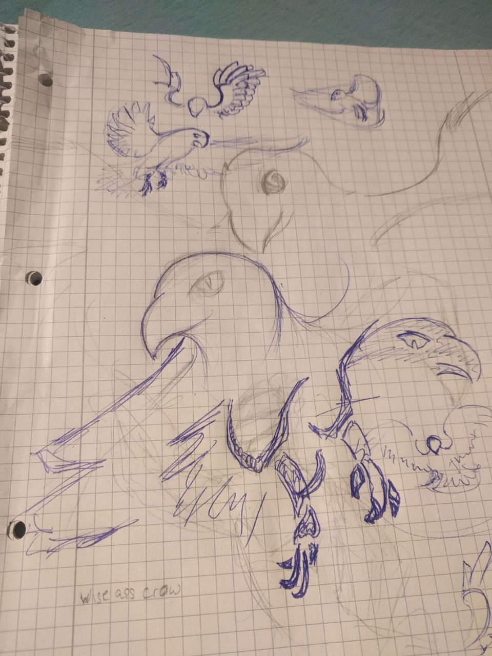
Initial sketches
I knew Inkscape was great for vector images. I even used it a few years back, but have since totally forgotten everything I knew about it, and a quick tryout showed my I would be better of watching a couple of tutorials first. These days, standing on the shoulders of giants is easy, a quick youtube search gave me insights into the basics and tips for simple logo design. Soon I was off to try this for myself.
So I dropped in the reference image I liked best and started playing. After some attempts I roughly traced it with the polygon tool while thinking about the general way I wanted this to look. It turned out pretty ugly, and I did not seem to move forward in a way I liked. So I turned back to analog: I printed what I had several times and drew funny things on.

Mixed media approach
While sunglasses, AR glasses and tools were a cool idea, I didn't manage to make them look that way (at least not in my opinion). But I liked the tribal style of the tail in the upper drawing and I liked the mechanical wing, so I decided to go with those.
I quickly found that Inkscape has a tool called "Draw Bezier curves and straight lines" or as I like to think of it, the "nice curves tool". You can draw straight lines by simply clicking to connect the dots. Or you can click, hold and drag to first set a vector along which your curve starts. Once you let go, a curved line preview appears connected to your cursor and you can bend it around to see what you like. The next click sets the end point. But beware: A simple click gets you only a straight line again. Either click and drag, for a more or less smooth transition, or - my favorite - hold shift, click and hold and start over - with a new curve, in a new direction.
Combine this with the "Edit paths by nodes" tool, which lets you bend existing lines and you can easily achieve fancy curved tribal designs with even the most questionable drawing skill.
From there on it is mostly about eyeballing nice flowing designs on top of what you have. I took some more time on the mechanical wing, and went back several times to readjust previously finished curves.
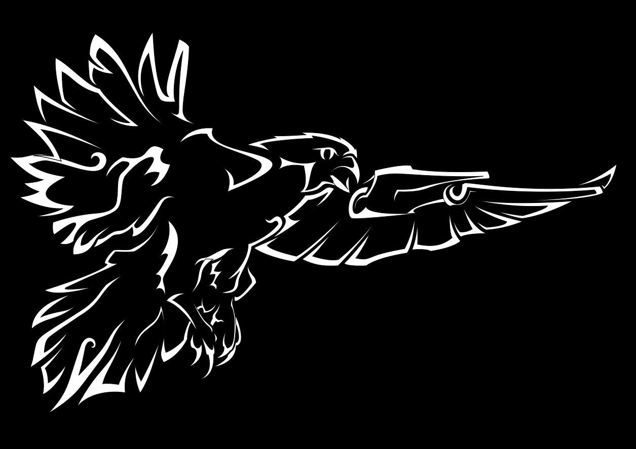
The first finished logo version
As you can see in the starting image, I managed to compile quite the nice hawk. It is at least halfway proportionally correct as I drew it over a stock photo. It has some technical elements, and it is mine.

Me with the first version of the logo
A friend of mine had access to a laser cutter and kindly cut out a stencil from some scraps. The result is promising, but showed some lines are too close. I increased the distances, but haven't gotten to lasercut them again
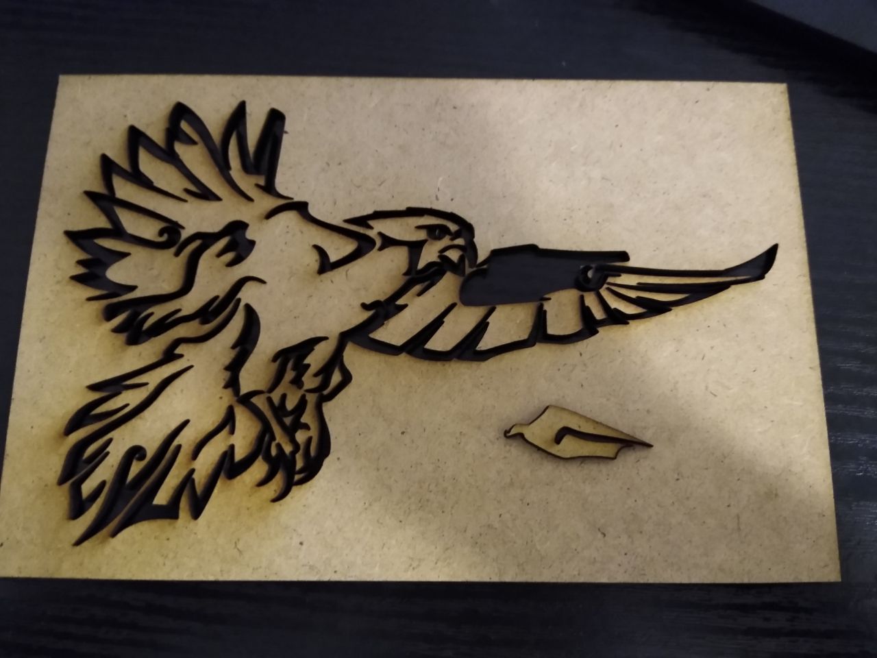
Lasercut stencil test
I did not get in all the elements I liked. I had to go back to the drawing board several times, and often I just dropped the pen or mouse and walked away to come back later. But I'm happy with the result and will stick it on anything in the next time to see how it works by field testing it. If it does not, I know how to improve it.
This idea has tried to make it out of my brain since years and seeing it in this finished version now is extremely satisfying. I have also brushed up on my Inkscape knowledge and made a nice tribal design, something I've wanted to do at least since I stumbled across WildSpiritWolf's amazing designs years ago and only now managed to my liking.
Overall this is beats what I expected. I encourage anyone willing to spend a couple of hours on a logo to try the same. I'm still kind of bummed out that I didn't manage to make the sunglasses look cool though - maybe next time ...